
How to Choose the Right Color Palette of Fabrics for Your Home
As a homeowner, decorate your room with long-term commitment in mind!
Every season the powers that be use buzzwords like “design trends” and “colors of the year”. The Pantone “colors of the year” this year are a blush pink called “rose quartz” and a dusty blue called “serenity”. Of course they want you to use these colors as accents to your existing “color story”, however we would be hard pressed to integrate these two colors into anything except a baby’s nursery!
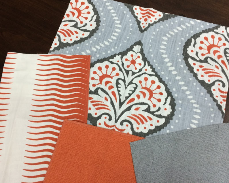
Decorating a room in your home involves more commitment than simply purchasing a new sweater in the “it” color of the season. The color choices we make when decorating our home are very personal. Some people appreciate the excitement of a loud print, whereas other people stick with neutral solids. There is no right or wrong. It is possible to have the comfort of a neutral solid as well as the excitement of a print. If you do your larger pieces of upholstery in solids and create a base palate, it is very easy to add interest to the room through patterned pillows and accent pieces. You can get fairly wild with the fabric on pillows because they are not a huge monetary commitment. In a year or so you can always make new pillow covers if you would like something different. A beautiful complimentary print added to a neutral room can add a lot of interest without an extreme amount of added cost. Another trick is to add a pop of solid color to a neutral palette. Is there a piece of art in the room that you can pull a color inspiration from? Do you have a favorite glass vase you want to use as a color muse? Trends should not dictate what colors you surround yourself in. Your own taste and preference should be your guide!
Contact us if you want quality furniture that provides comfort, function, and style! We at La Bella Cosa, located in Culver City, CA, know that you want the very best custom furniture and we’re here to provide exactly that.